Welcome to the Cinedept brand guidelines. The following information outlines the visual identity system of our brand. Use your best judgment and reference this document as a starting point. Please do not alter, change, adapt, or evolve the identity system or layouts. Brand integrity is essential, created through consistency and the detailed consideration of all touchpoints.

Contents

Logo

Index System

Typography

Colour

Application

If you have any questions about the content of this document please contact: info@nonstandard.studio

Logo

Wordmark

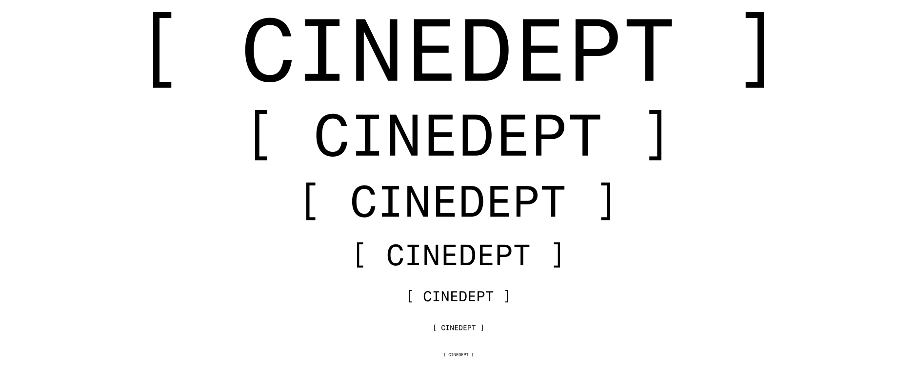
The cinedept wordmark is one of our key identifiers. The rules around our wordmark ensure that it is always treated consistently. The wordmark itself is confident, dynamic and timeless. It can adapt based on the application and is used as a framing device when needed.
Alternative alphanumeric numbermark: 3,9,14,5,4,5,16,20.
Download

On colour

When combining the wordmark or logo with brand colors, always ensure there is ample contrast in color pairings. The following examples are approved combinations.

Scaling

The logo has been carefully crafted to read well, even at small sizes. There is no limit at large scale, but be careful at smaller sizes.
If legibility is an issue, it’s too small.

Print minimum size
6mm (H)
Screen minimum size
8px (H)

Clear space

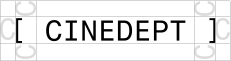
The right amount of space around our logo helps it to look as intended.The clear space we've defined keeps other graphics at a safe distance. It is defined by the height and width of a “C”.

Device

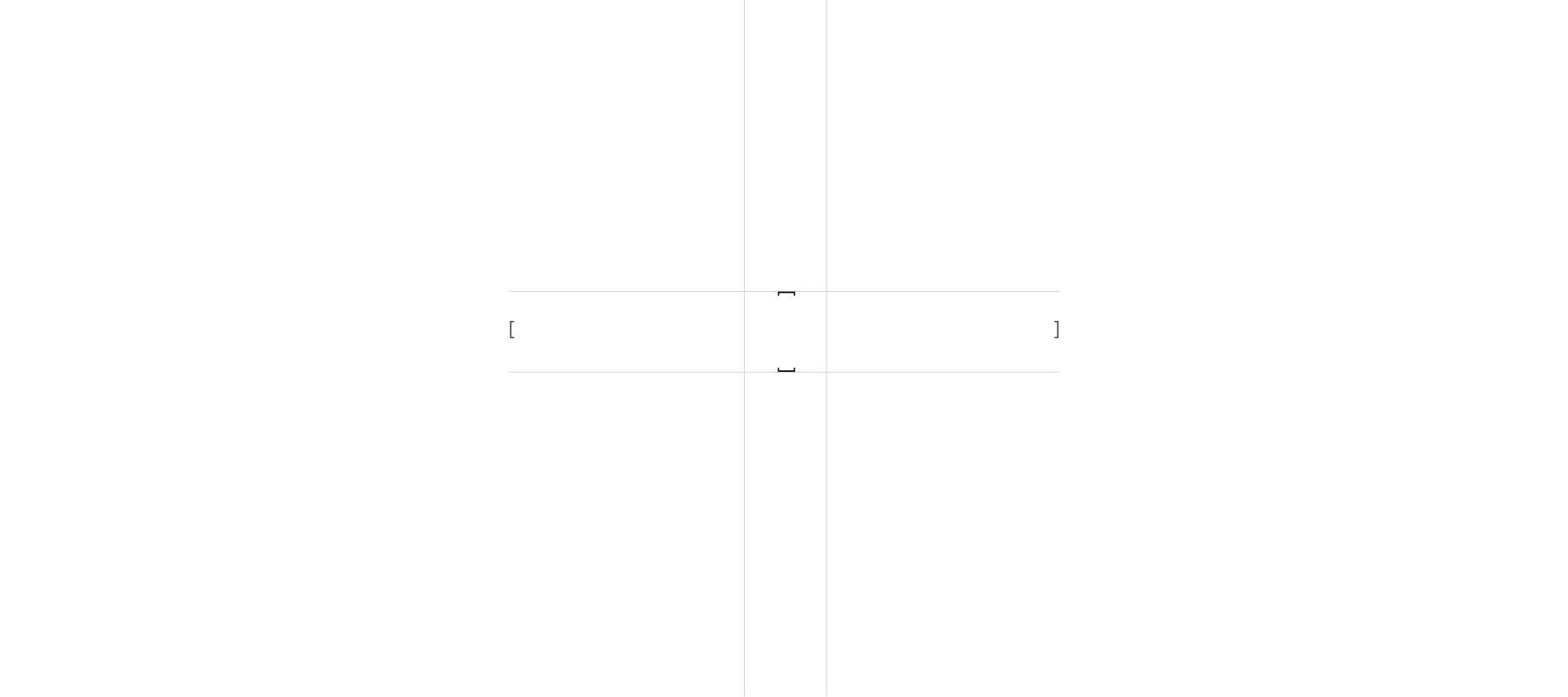
The square parentheses serve a dual function: they both frame the letter and number wordmark, reinforcing its visual identity, and stand alone as a symbol derived from the brand’s initials, offering a strong, recognizable graphic element. When using, make sure that there is ample spacing between content and the symbol.

Index System

Overview

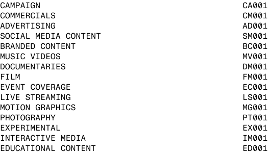
Having a simple but systematic indexing system for each piece of content ties the breadth of the agencys output.
Each piece of content should have an associated index code. If the need arises to add a new category –
use your best judgement in assigning an appropriate initial. content category initials should only ever have “2” letters.

Construction: “fragment Mono” is intentionally utilised for its fixed letter spacing –
which helps create consistency in formatting.

“Category Initial” / “zero” / “Month”

Alternative “0” with the slash through it and underlined “1” should always be used.

System Function

Follow these steps to ensure consistency when creating the “internal Index System’s” code.

Category Initial
Each piece of output is given a initial based on the category of output.

Spacer
“0” (zero) provides a numerical space.

Month
The month of completion, should always be 2 characters, e.g. “02”, rather than “2”

Code
Each “extended” index code should first include the associated project index code.

Client
the full name of the client.

Category
the full title for the category of output.

Use a forward slash “/” to separate each of the system elements.

Typography

Typefaces

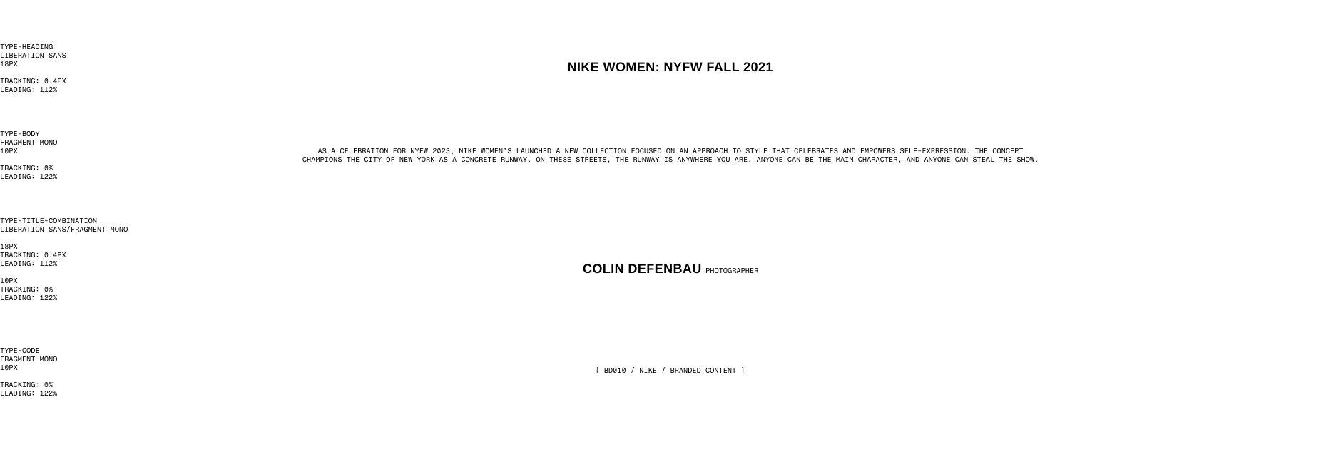
cinedept’s brand typefaces are “liberation sans” and “fragment mono”. The pairing of Fragment Mono and Liberations Sans allows us to balance between a serious/refined aesthetic with fun/youthful creative moments. When these font's are not available for use, in any case, please use the following fallbacks to make sure layouts remains consistent, even when the brand font's aren't available: "Arial Bold" and "Menlo".

Download

Weights

Type weight provides hierarchy to distinguish between pieces of information. Use this as a guide for typeface weights employed in our brand.

Hierarchy

To keep things simple in communications,we recommend using a maximum of two different type sizes per communication (not including legalese). There may be exceptions, e.g. When space is limited, affecting legibility of type.

Here we have outlined a type scale for printed and digital communications to refer to when typesetting new applications. The web styling has been broken down from their CSS styles.

Setting Type

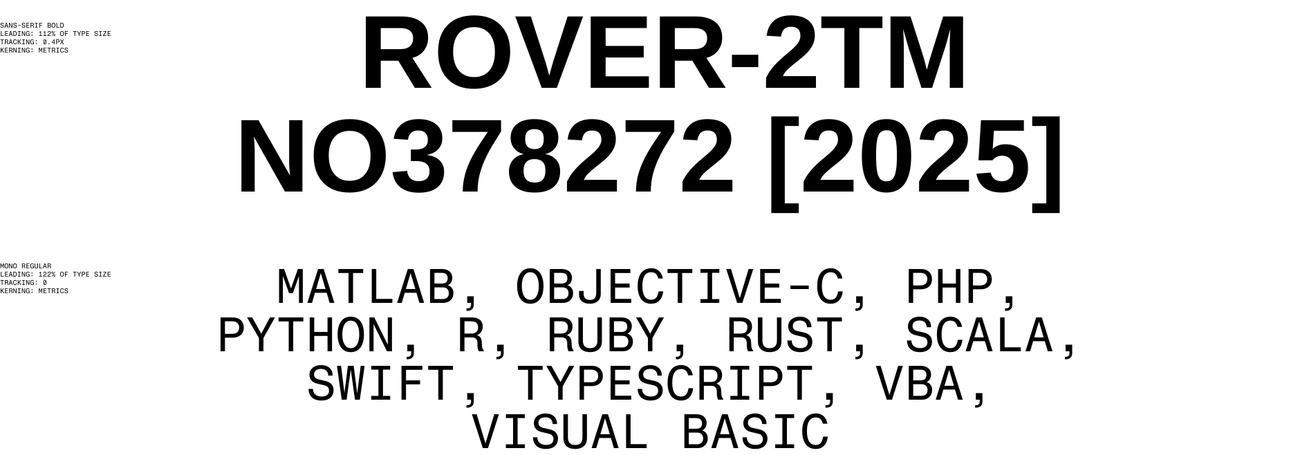
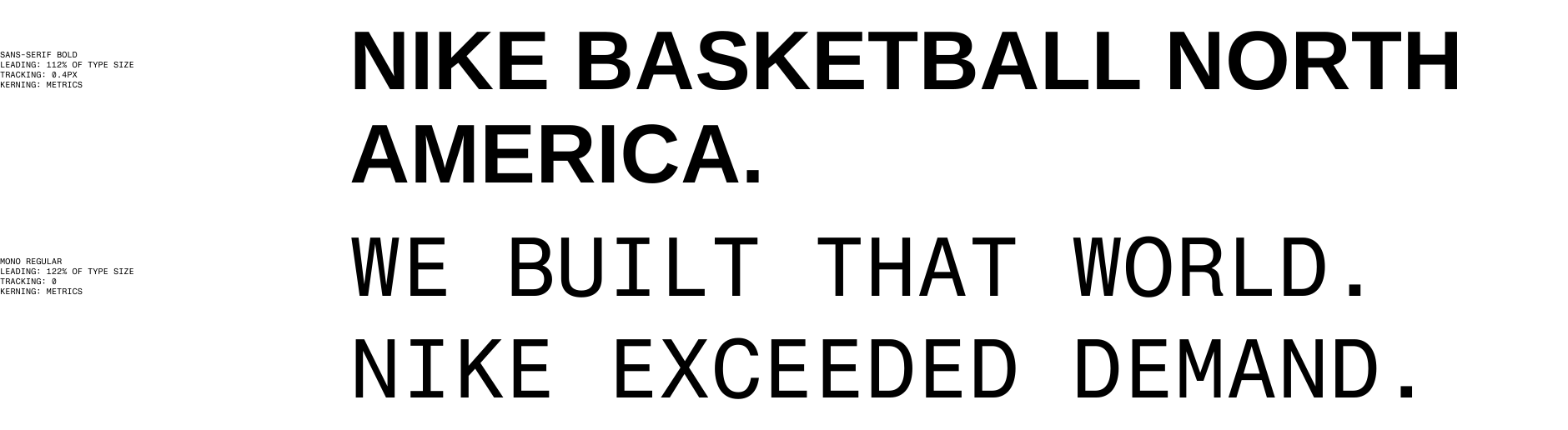
When setting type, consider the tracking (spaces between the letters), leading (spaces between lines of copy) and kerning (spacing between letterforms). See below for the parameters according to type family and weight.

Type Applied

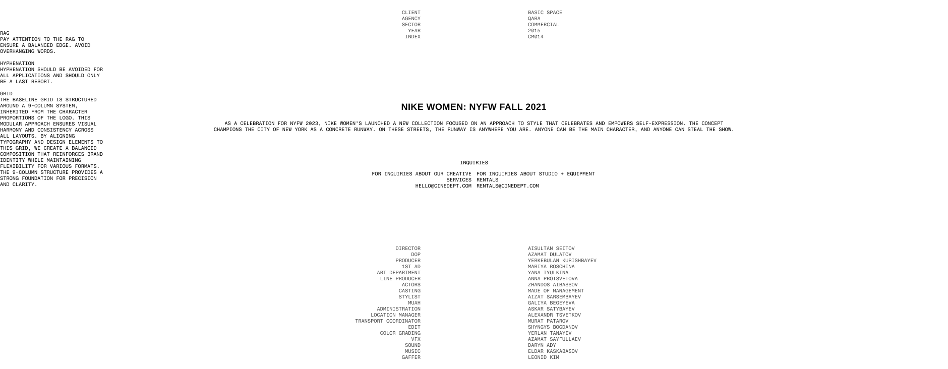
Styling & Hierarchy should all be set in title case with no more than two sizes (excluding legalese). The typographic system is complex and therefore should be applied with care. The typographic system frames and centres content. always centre or left align body text. Content detail text can be left and right aligned. Never justify text.

Colour

Palette

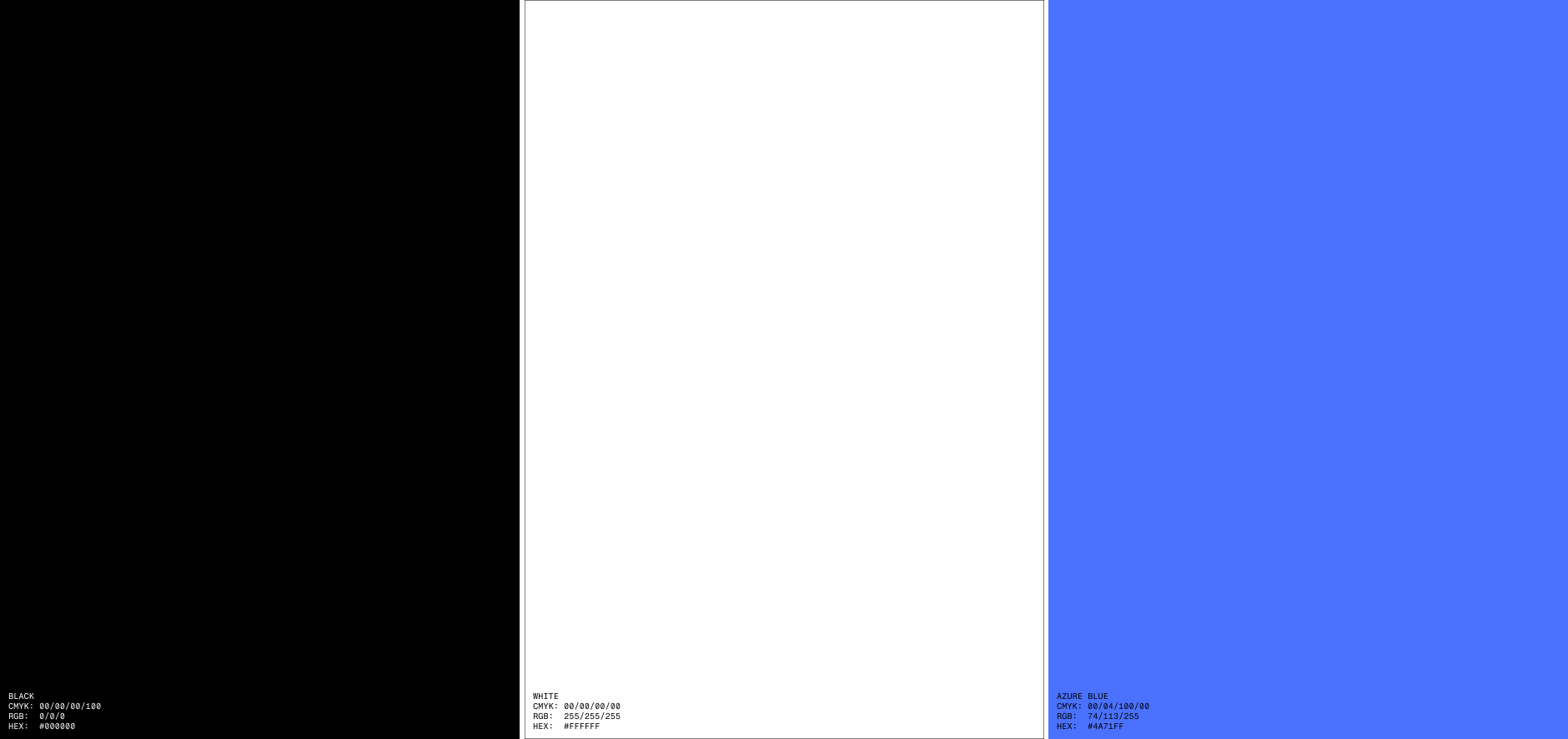
At its core cinedept is a black and white brand, a neutral paired back palette with a blue accent to create focus on specific outputs of the agency’s work.

Effects

Blurred background elements introduce a sense of motion and layering, subtly referencing depth of field in cinematography.
Blur applied: black at 20% transparency, blur of 30px (Figma).

Proportion

The balance of color is important to maintain a cohesive identity. When using the palette in any context –
reference the proportion of colors below. Be mindful when using coloured text over images or video.

Use your best judgement to ensure readability.
Aim for a 4.5:1 contrast on all expected background areas.

Application

Digital

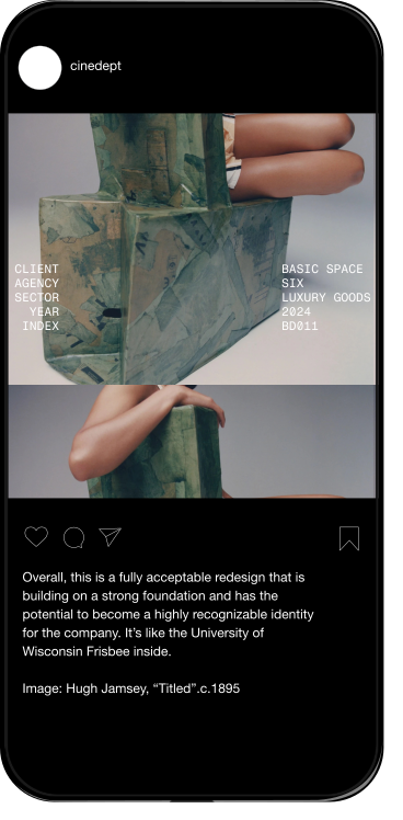
The typographic system can be used to "frame" content across various media.

Digital

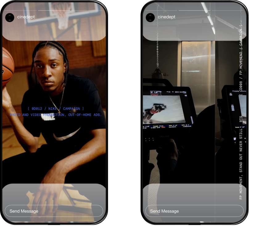
Colour can also be used to “focus” production (Blue), or behind the scenes (white).

Physical

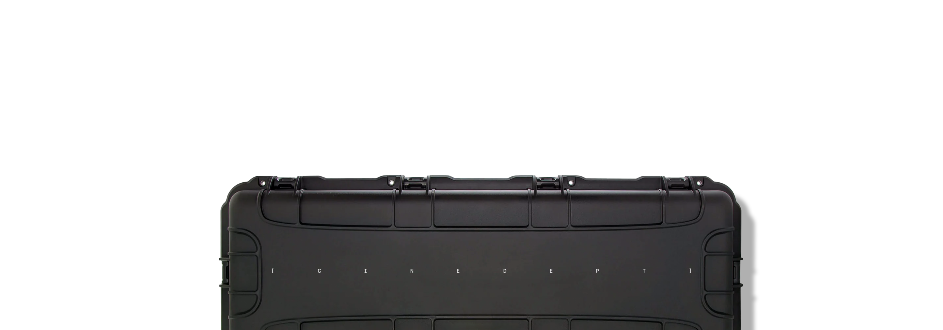
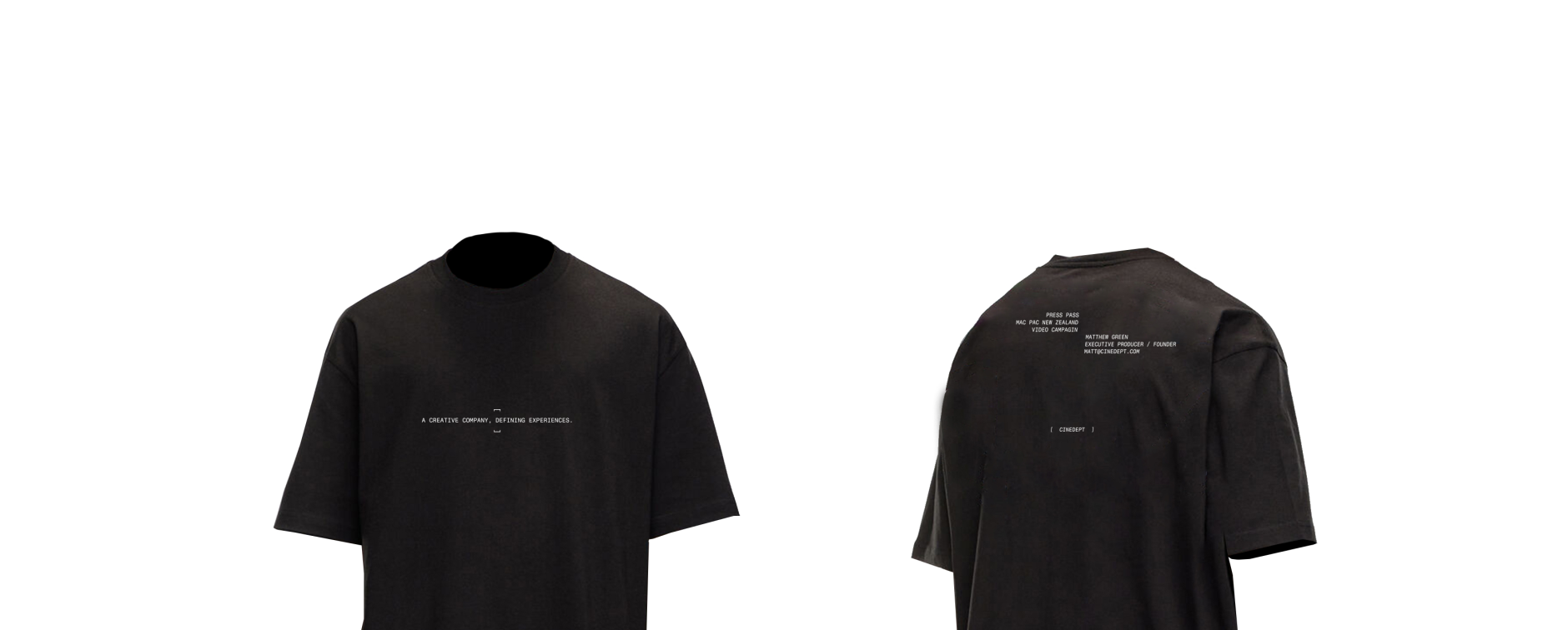
“Framing” type system can be used in a variety of instances and lockups.

Physical

“Framing” type system can be used in a variety of instances and lockups.
CINEDEPT.COM